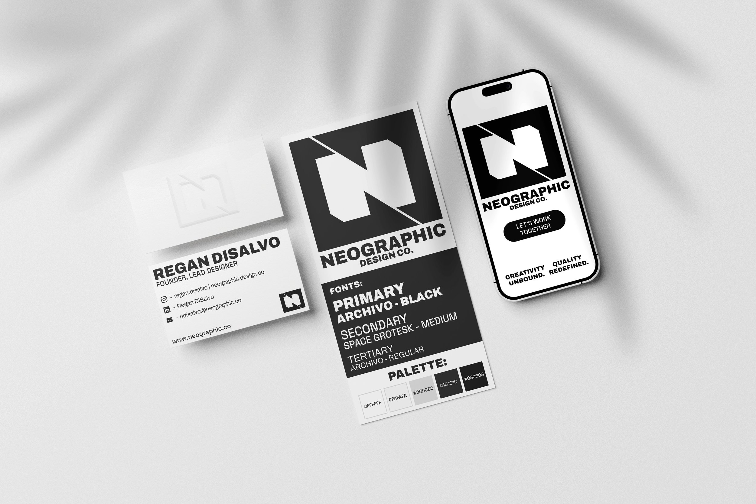
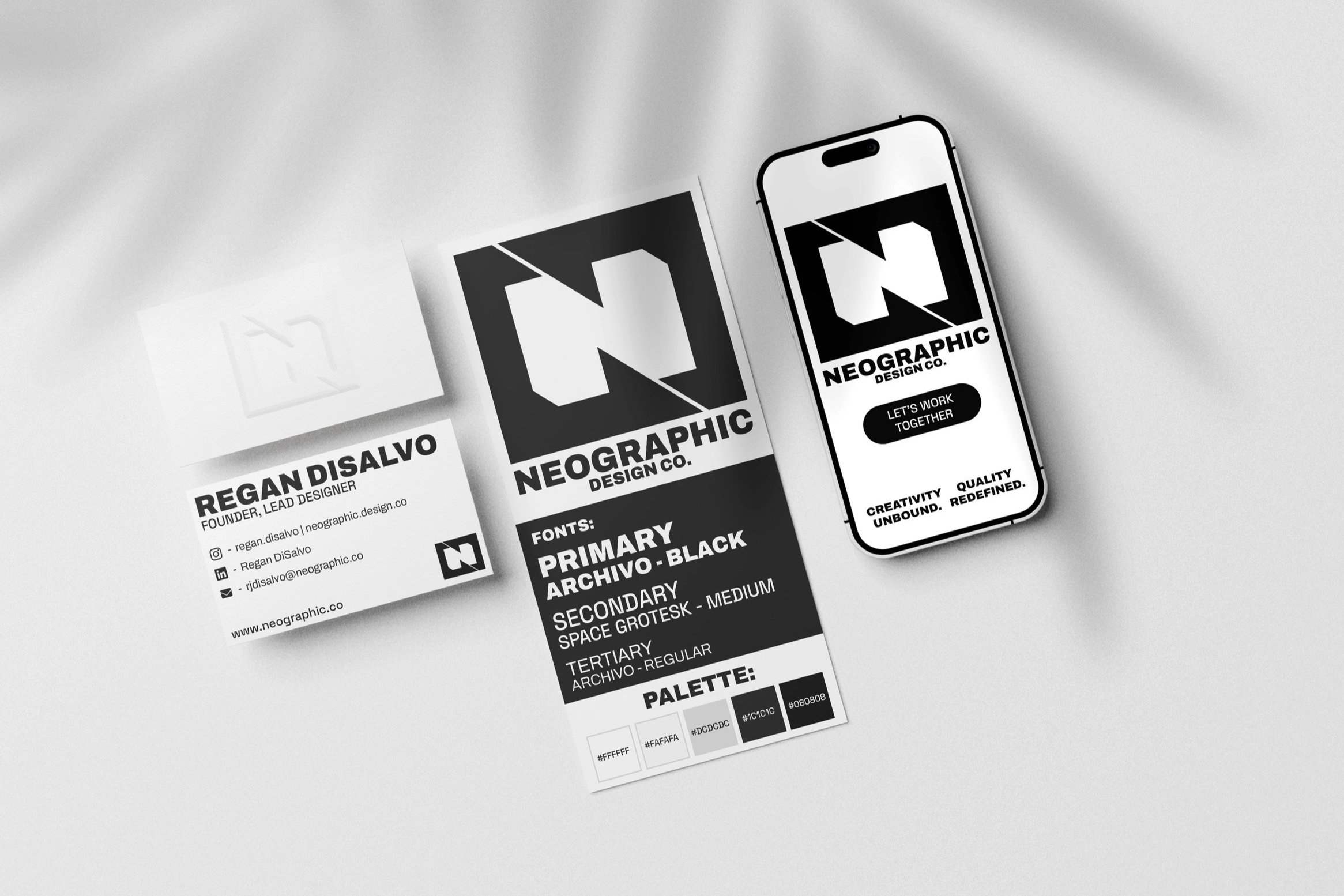
NEOgraphic Design Co. Self Rebrand
Part of growing as a creative is maturing in your process and approach. This rebrand signifies a shift towards a prioritizing timeless, simple, impactful design in the branding process. Lets take a Deeper look.
LOGO BREAKDOWN
BUILDING A BRAND
And making it to last
“Bold, Modern, Minimal, Timeless, Geometric, Creative, Eye-catching”
With every logo, and every brand, there has to be purpose. Something that anchors a brand to its identity, not just a logo to throw on anything you do so it’s occupied. A brand is also more than a logo, it’s an identity, a guideline, a language, meant to communicate who you are even without words.
Before pencil meets paper or any grid based documents are opened, you have to explore the purpose. What is the industry? Who’s your audience? What do you like? What nouns capture your brand? What values and traits matter the most to you and your brand?
These are some of the questions that help connect intangible values and preferences to a tangible and visible identity that communicates who you are with a single glance. When it comes to rebranding Neographic as a design brand, it requires a lot of self exploration in order to balance these factors with a sense of being a multidisciplinary designer and being flexible enough to span the vast scope of clients I’m trying to reach. That process led to a clear, defined list of parameters for this design:
“Bold, Modern, Minimal, Timeless, Geometric, Creative, Eye-catching, must use the three main letters: N, G, and D”
From sketch to (digital) Reality.
Once the direction, nouns, and parameters of the design are set, the exploration process begins. Every project goes through a series of inspiration gathering and rough sketching, with a focus on ideation over quality. Naturally the process lends itself to funneling down more usable and applicable ideas, resulting in the final sketch seen here.
Once the final sketch (or usually group of sketches) is settled upon, they’re all photographed and taken into Illustrator to create a more clean and vectorized version of the icon, using grids and more precision tools to clean up lines, lock in geometry, and ensure visual consistency.
Clean up time.
Sketches are imperfect by nature. That’s what freeing about the process of it, and in some cases desired for the final product. For this identity though, as mentioned previously, the cleanliness and geometry are of top priority, right behind the inclusion of the three letters. With a shift of the primary triangle shapes and a slight bumping up of the negative space between halves, all three letters and the overall geometry become more optically balanced, as well as more scalable for any size and usage.
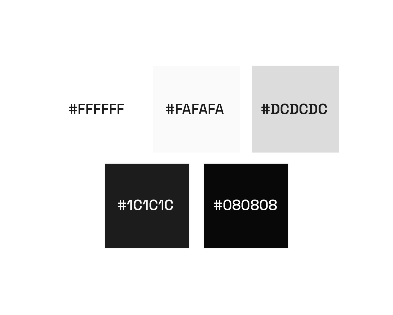
FONTS:
Palette:
Alt 1:
Alt 2:

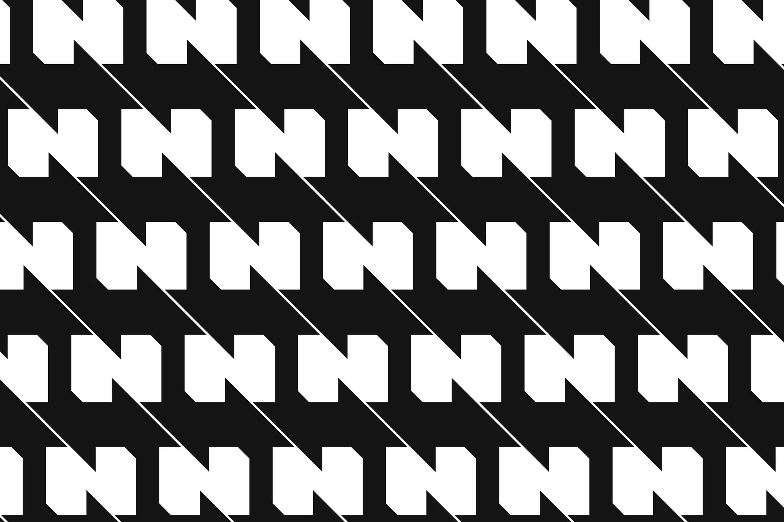
PATTERn:
MOCKUPS
